
Your hall is the first space people see when they enter your home. It sets the mood for every other room. A thoughtful colour combination for hall walls creates a strong first impression. The right palette can make your home feel warm, stylish, and welcoming.
Choosing the right colours does not have to be overwhelming. This guide covers the best colour combinations for hall spaces. You will find ideas for every taste and home style.
Why the Right Colour Combination Matters
Colour has a powerful effect on human emotions and perception. In a hall, colour shapes how the entire home feels. Bright colours make the space feel open and lively. Darker tones create a cosy and intimate atmosphere.
The right colour also affects how large or small your hall appears. Light shades visually expand a narrow hall. Deeper tones add richness and depth to larger spaces.
Your hall walls offer a large canvas to express your personality. Use this space to reflect your design vision clearly.
Best Colour Combination for Hall
Finding the best colour combination for hall walls depends on your goals. Think about the atmosphere you want to create. Consider the hall size and the amount of natural light it receives.
Here are some popular and effective hall colour combinations.
White and Grey
White and grey is a timeless and elegant pairing. White brightens the space and reflects natural light beautifully. Grey adds a sophisticated tone without overpowering the room. This combination suits both small and large halls equally well. Use white on the ceiling and grey as the dominant wall colour. Add wooden furniture or warm accents to soften the palette.
Beige and Brown
Beige and brown create a natural and earthy atmosphere. These warm tones feel soothing and easy on the eyes. They also complement most furniture styles and flooring types. Use beige as the base wall colour for a calming effect. Introduce brown through accents, frames, or textured rugs. This combination gives your hall a grounded and inviting character.
Blue and White
Blue and white is a classic combination with timeless appeal. Light blue walls paired with white trims look fresh and clean. This combination works well in halls that receive good natural light. Navy blue with white accents delivers a bold and structured look. It suits both modern apartments and traditional homes beautifully.
Green and Cream
Green and cream bring a refreshing and natural quality to any hall. Sage green paired with cream walls creates a calm and welcoming space. This combination connects the interior to the natural world outside. Guests feel an immediate sense of warmth and serenity. Add potted plants and natural textures to enhance this palette further.
Royal Colour Combination for Hall
A royal colour combination for hall spaces adds grandeur and timeless elegance. These palettes use rich, deep, and luxurious tones. They bring a sense of heritage and prestige to your home.
Deep Purple and Gold
Deep purple with gold accents creates an instantly regal atmosphere. Apply purple to a single feature wall for maximum visual impact. Add gold-toned light fixtures, frames, and decorative accessories. This combination looks stunning in spacious halls with high ceilings. Pair it with dark wood furniture to complete the royal aesthetic.
Burgundy and Cream
Burgundy is a rich, deep red that commands attention and respect. When paired with cream, it balances intensity with softness perfectly. Use cream on the ceiling and upper walls for a lighter feel. Apply burgundy as a bold accent on lower wall panels. This pairing gives your hall a refined and dignified personality.
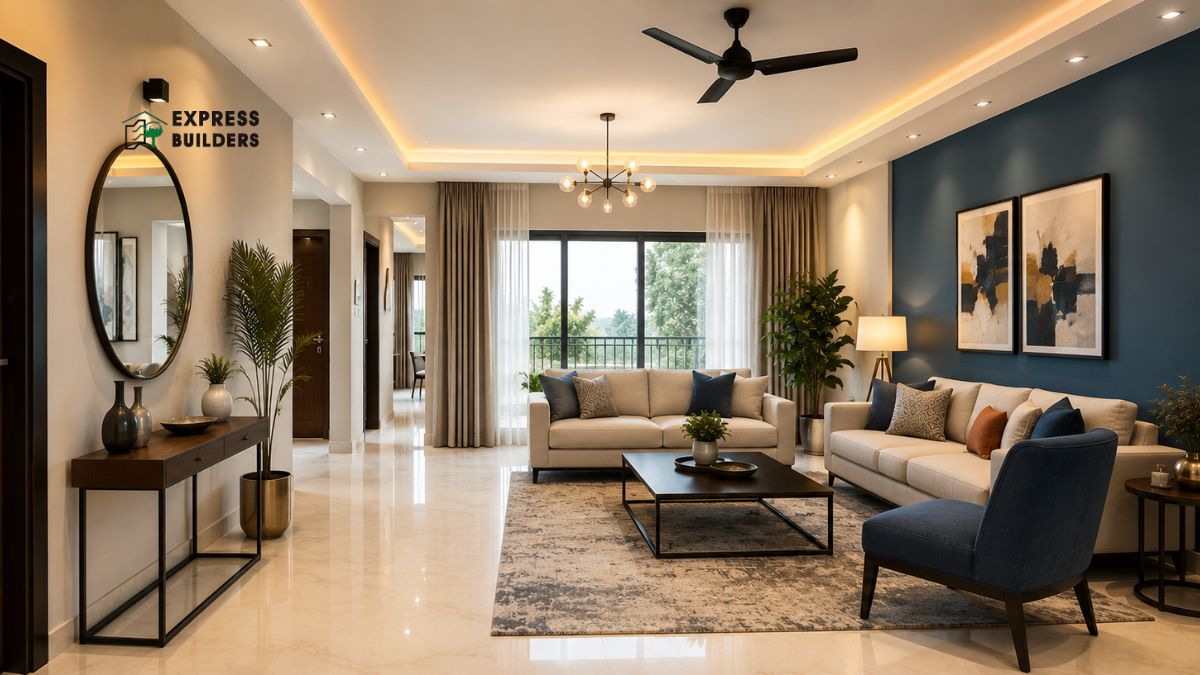
Midnight Blue and Silver
Midnight blue creates a deep and luxurious atmosphere in any hall. Silver metallic accents add a modern and contemporary royal touch. Use silver in frames, light fittings, and decorative objects. This combination works well in halls that receive limited natural light. It adds mystery and elegance to your home’s first impression.
Hall Wall Colour Combination for Living Room
Many homes have halls that open directly into the living room. In such layouts, the hall wall colour combination for living room transitions must feel seamless. A disjointed colour change can make the spaces feel disconnected and poorly planned.
Use Complementary Shades
Choose colours that sit near each other on the colour wheel. Warm beige in the hall pairs naturally with soft terracotta in the living room. The transition feels gradual, intentional, and visually pleasing. This approach ties both spaces together without making them identical.
Use One Colour in Different Shades
Pick one base colour and apply different tones in each space. Use a lighter shade of olive green in the hall. Then use a richer, deeper shade of the same green in the living room. This strategy creates a unified look with a subtle and elegant contrast.
Use a Neutral Connector
White, off-white, or light grey works as a strong visual bridge. Apply these neutral tones to the ceiling or trim in both spaces. This ties the hall and living room together as part of one design story. It creates harmony without sacrificing individual character in each room.
Pop Colour Combination for Hall
A pop colour combination for hall walls adds energy and personality instantly. Pop colours are bold, bright, and visually stimulating. They work best when used as accents on a single feature wall. This approach prevents the hall from feeling overwhelming or visually cluttered.
Yellow and Charcoal
Yellow is cheerful, energetic, and impossible to ignore. Charcoal is strong, grounding, and adds sophisticated balance. Together, they create a powerful and modern contrast. Paint one wall in charcoal and introduce yellow through cushions and artwork. This gives the hall a bold and contemporary personality.
Coral and White
Coral is a warm and lively colour that radiates positive energy. A coral feature wall with white surrounding walls looks bright and welcoming. This combination works beautifully in halls with minimal furniture and decor. The natural warmth of coral makes every visitor feel instantly at home.
Teal and Off-White
Teal is a bold yet sophisticated colour choice for any hall. Off-white tones down its intensity and adds a sense of balance. Use teal on the main feature wall for a striking focal point. Keep the remaining walls in a soft off-white tone. Add copper or brass accents to elevate the overall design.
Orange and Dark Brown
Orange brings energy, warmth, and visual excitement to a hall. Dark brown grounds the colour and prevents it from becoming too intense. Use orange as an accent rather than a dominant wall colour. This combination creates a vibrant and welcoming hall atmosphere.
Wall Paint Colour Combination for Hall
Selecting the right wall paint colour combination for hall spaces involves more than picking a shade. The finish of the paint plays a significant role in the final result.
Matte Finishes
Matte finishes absorb light and create a soft and elegant look. They are ideal for hiding minor wall imperfections and uneven textures. Use a matte finish on large wall surfaces for a refined appearance.
Glossy and Satin Finishes
Glossy and satin finishes reflect light and add brightness to the space. They work best on trims, doors, and accent walls. Satin finishes are easier to clean and maintain over time. They are a practical choice for high-traffic hallway areas.
Light Colours for Small Halls
Light pastel shades like powder blue, mint, and blush pink expand small halls visually. They keep the space airy, fresh, and open. Avoid using too many dark tones in a compact hall. Stick to two or three coordinating tones to maintain visual clarity.
Dark Colours for Large Halls
Large halls can handle bold and deep paint colours with ease. Charcoal, forest green, and navy blue create a dramatic and impressive entrance. Balance these deep tones with light-coloured ceilings and bright trims. This prevents the hall from feeling overly heavy or closed in.
Textured Paint for Added Character
Textured paint adds dimension and visual interest to plain hall walls. Stucco, sandstone, and sponge finishes create a rich and tactile surface. They add uniqueness and depth to your hall design. Combine a textured feature wall with smooth paint on the remaining walls.
Tips for Choosing the Right Colour Combination
- Always test paint samples on the wall before making a final decision. Observe the colour in both natural and artificial light. Light conditions change significantly throughout the day.
- Think about the size and shape of your hall carefully. Narrow halls benefit from lighter and cooler tones. Larger halls can accommodate bolder and warmer shades.
- Consider your existing furniture, flooring, and light fixtures. The new colour combination must complement these elements. Clashing tones create visual confusion and reduce the hall’s appeal.
- Apply the three-colour rule to keep the design balanced. Choose one dominant colour for the walls. Select one secondary colour for accents and accessories. Use one neutral to bridge both tones together seamlessly.
Conclusion
A well-chosen colour combination transforms your hall into a beautiful and inviting space. Whether you love royal tones, pop accents, or calming neutrals, the perfect palette exists for your home. Start with a clear vision, test your choices, and commit with confidence. Your hall deserves to make a statement that lasts.
Ready to build your dream home? Express Builder delivers quality construction and beautifully designed interiors tailored to your vision. Book a site visit today and see the difference for yourself. Contact the Express Builder team now to schedule your visit and take the first confident step toward your perfect home.
FAQs
Q1. What is the best colour combination for a small hall?
Light colours are the best choice for small halls. Shades like off-white, powder blue, and pale mint green visually expand the space. Pair light wall colours with white ceilings to create a sense of height. Avoid dark tones that make a compact hall feel cramped and heavy. Stick to two or three coordinating colours to keep the design clean and open.
Q2. Which royal colour combination works best for a hall?
Deep purple with gold, burgundy with cream, and midnight blue with silver are excellent royal choices. These palettes use rich and luxurious tones that add grandeur to any hall. Choose one dominant royal shade as the feature wall colour. Balance it with lighter accent tones to prevent the space from feeling too dark or overpowering.
Q3. How do I connect hall colours with my living room?
Use colours from the same family or complementary tones in both spaces. Apply a lighter shade in the hall and a deeper shade in the living room. Use white or off-white on the ceiling of both rooms to create visual continuity. This approach makes the hall and living room feel connected and part of one cohesive design.
Q4. What are good pop colour combinations for a hall?
Coral and white, teal and off-white, and yellow and charcoal are excellent pop colour combinations. Apply bold shades on a single feature wall to avoid visual overload. Balance bright tones with neutral walls and simple furniture. This creates a stylish, energetic hall that feels lively without feeling overwhelming or busy.